Vuepress is a simple framework to generate static webpages. I had that idea to use vuepress to make a static photo gallery for my own website.
Give image path in markdown and no more
The only design principle is to create a gallery page by providing only image paths.
...
- 
- 
- 
....
You'll have to write a custom vue component where you can put style sheet and scripts to handle layouts and other more functionalities.
Vuepress will parse the markdown and include it into your custom component to do a server side rendering, which outputs a static webpage.
Vary width grid view with flexbox
A vary-width grid view of elements can be made very easy with flex-wrap.
Display size of the element along the flex-direction is calculated based on flex-grow and the actual size of the element (e.g. the image width if flex-direction: row).
 If elements overflow a row flex container, those that can not fit into the first row will be wrapped to the second row, so on and so forth.
In the align direction, just hard code the height to be some value, 40vh (40% of the display height) looks good for photos according to some posts I read.
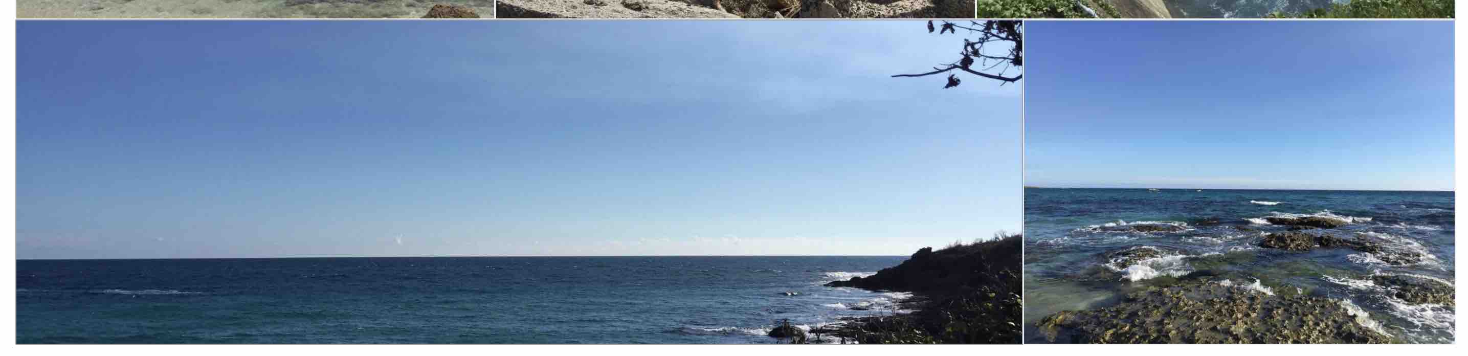
For the markdown example above, it renders
<ul>
    ...
    <li><img src="foo1.jpg"/></li>
    <li><img src="foo2.jpg"/></li>
    <li><img src="foo3.jpg"/></li>
    ...
</ul>
So in the gallery component, style is set as:
ul
    display: flex;
    flex-wrap: wrap;
    list-style-type: none;
    padding: 0;

li
    height: 40vh;
    flex-grow: 1;
    list-style-type: none;

img
    max-height: 100%;
    min-width: 100%;
Note that the image is resized in this setup, check out object-fit if you want to keep its aspect ratio.
img
    object-fit: cover;
    max-height: 100%;
    min-width: 100%;
For responsive on phone, have the <li> to be width: 100% which forces one image each row.
@media (max-width: $MQMobile)
    li
      max-height: 55vh;
      width: 100%;

@media (max-width: $MQMobileNarrow)
    li
      max-height: 75vh;
      width: 100%;
Nasty last row
Flexbox has the drawback that it can not perfectly handle flex-grow together with responsiveness, at least as far as I know.
For an extreme example, if only one photo is left to the last row, it would be stretched to the row width (default flex-grow: 1).
 The last-child selector can be used to change the last photo's
 flex-grow to 0, so that it does not stretch.
In my opinion, it does not entirely solve the issue. When resolution changes on other devices, this last photo could be in a row together with other photos. In the example below, there are two photos in the last row, the flex-grow difference still causes one photo to stretch.
 The takeaway is that it is hard to make it perfect on every device. Tune the order of the photos to till it looks good on one device and forget about others. Not such a big deal, as it is not an issue on very narrow screens (phones) where every row has only one photo.
Lazy loading
A thumbnail auto generation is hard to fit into the vuepress infrastructure. Using original photos in the gallery preview definitely burdens networking and rendering. (Browsers usually re-render when a new image is loaded.)
Lazy loading, which loads images only when they are visible, is natively supported in most browsers. An <img/> with attribute loading="lazy" should be lazy loaded. Using markdown plugin such as [1] easily converts your markdown images to lazy loaded.
However, there is something about lazy loading with Chrome according to [2], which I also reproduced and verified. Chrome (version 83.0.4103.97) is kinda aggressive about loading. It loads image far ahead of your visible window, which is a bad thing for webpage with all photos. Firefox does not have this issue (or feature).
Note that images initially have no width. Therefore, images are in the same flex row before they get loaded.
 So even with lazy loading, more than necessary images are loaded in the first place (Think about when images are loaded, they wrap around and push the content below into invisible regions).
To make it better, one possible approach is to make the image container (<li> in the context) reactive. Provides it with a hard coded width in server side rendering, then use a js based lazy loading and set a callback to flip the width to auto after the image is loaded.
TODO: Alter src to data-src and do lazy loading manually with lozad.
Photo viewer
TODO: Add a photo viewer with v-viewer. Should be straightforward, just inject a click event for each <img> in mounted().